
We are looking at themes in Wildfire, and one idea is to consolidate all current themes into one, but give settings in that theme that recreate all the current themes.
Surf is now the default theme, so that would become the Wildfire theme, with other themes recreated as Theme settings.
Some possible Theme settings:
Tide mode - header and menu are fixed at top of page, disappear on scroll. (currently Tide is based on Stone, but this would make it possible for Surf and Tower to have a disappearing header.)
Tower mode - hamburger menu only at all screen sizes. (This overrides Stone)
Stone mode - Menu is below header, second level of menu opens in fixed bar.
Other possibilities:
Roundedness: add rounding to blocks / columns / sections
Super padding: add extra padding / margin to all blocks / columns / sections?
Current layout:
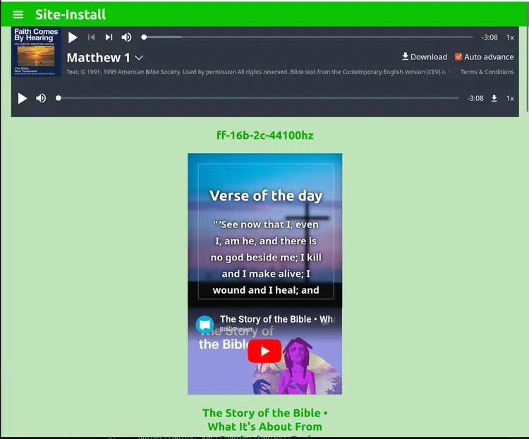
Super padding
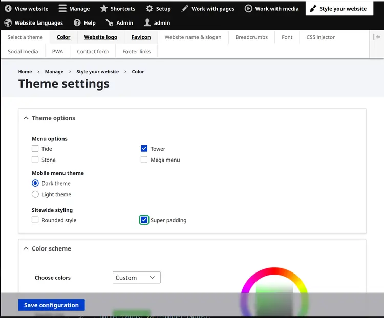
Turn on Super padding in Theme settings:
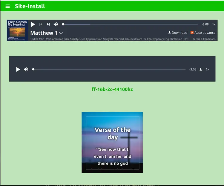
Result:
Motivation:
As a default. there is no padding/margin between items. It is possible to add separators, but it would be easier if everything had automatic padding.
Roundedness
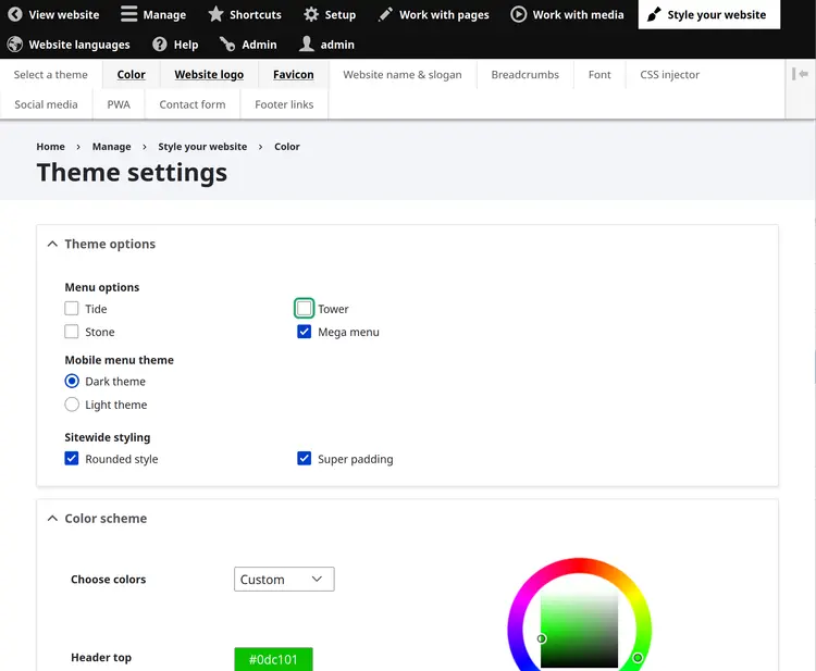
Turn on roundedness:
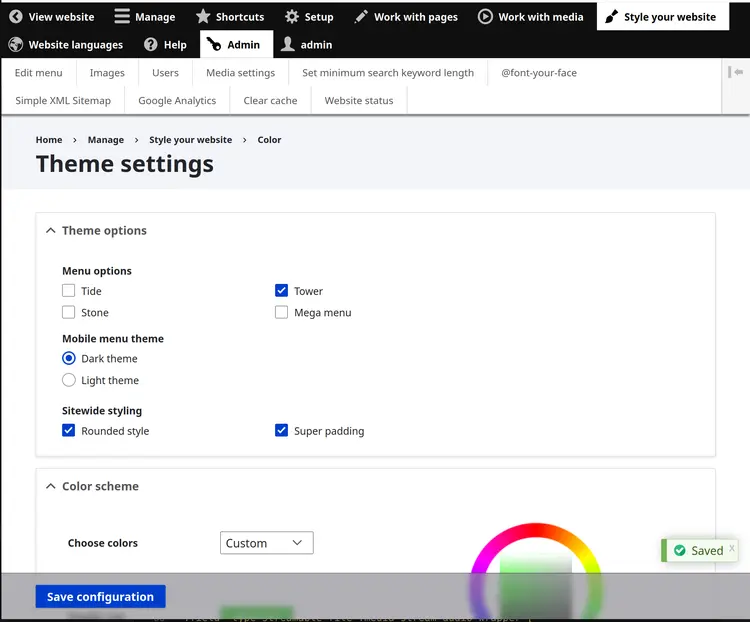
Result:
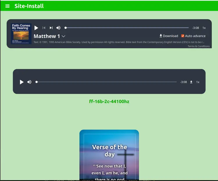
Mega Menu
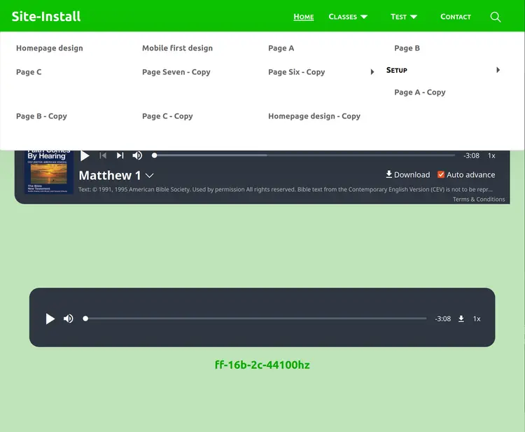
A larger dropdown menu that is fullwidth, increases in size depending on the number of menu items / pages in the menu.
Still experimental.
Questions:
- should the pages list vertically first or horizontally first?
- could submenus be collapsible rather than dropdown menus?
Result:
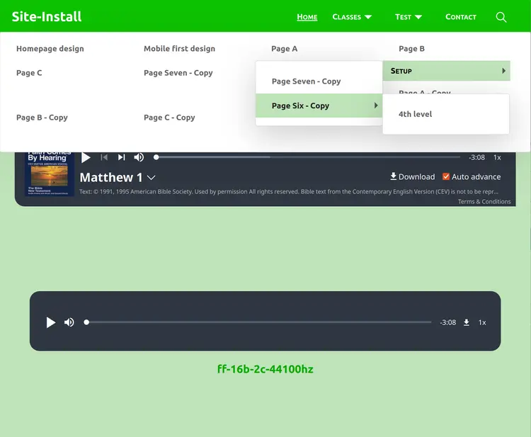
with submenus:
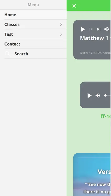
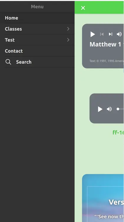
Mobile Menu Light theme
Dark vs Light theme for mobile
Menu out-of-screen problem
There are occasions when menus are clipped because they are at the edge of the screen.
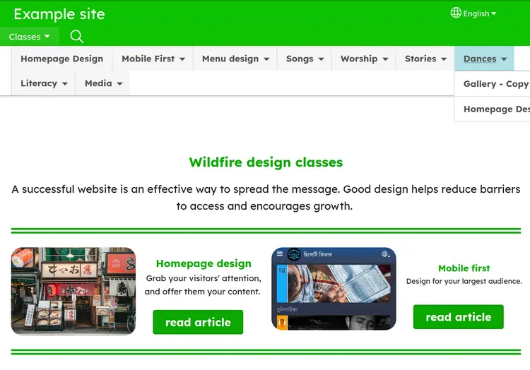
When the menu item is close to the edge of the screen, this occurs.
There is JS code to open the next level down to the left if it would go offscreen, but nothing at this level.
This occurred in Stone theme. It could also happen in Surf, if the Language picker is not there or if it has wrapped to the left in smaller screens.
Possible solutions:
- JS to reposition the menu when it's at the edge of the screen
- Add some padding so that menu items are not placed so close to the edge of the screen (this is only a partial fix)
- Moving the dropdowns to open centrally below the menu item above could also help this issue
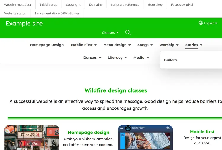
In the image above, there is padding keeping the menu-items more central. The dropdowns are much wider than currently, but centralized they work better at staying onscreen
