Mobile-first design in Wildfire
On this page
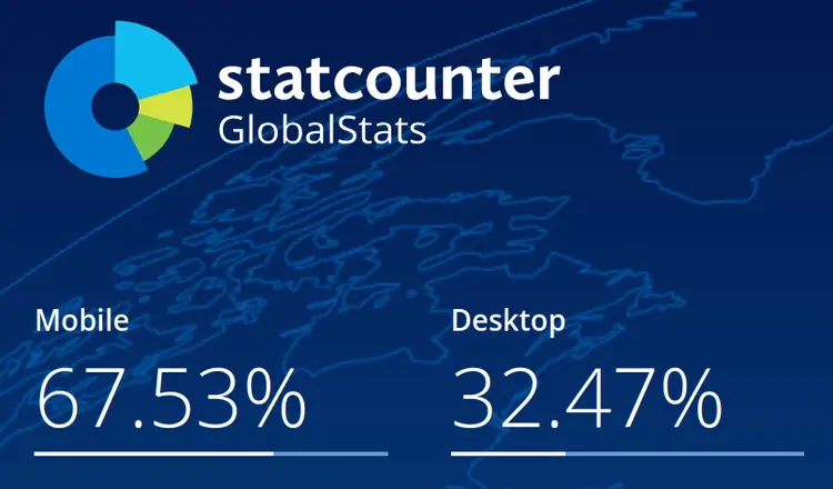
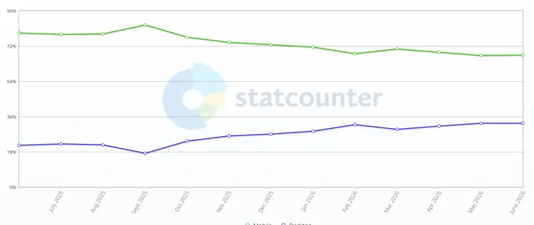
- Principle #1: Most visitors are mobile
- Principle #2: Less is more
- Principle #3: Speed matters
- Principle #4: Easy navigation
- Principle #5: Layout changes in mobile
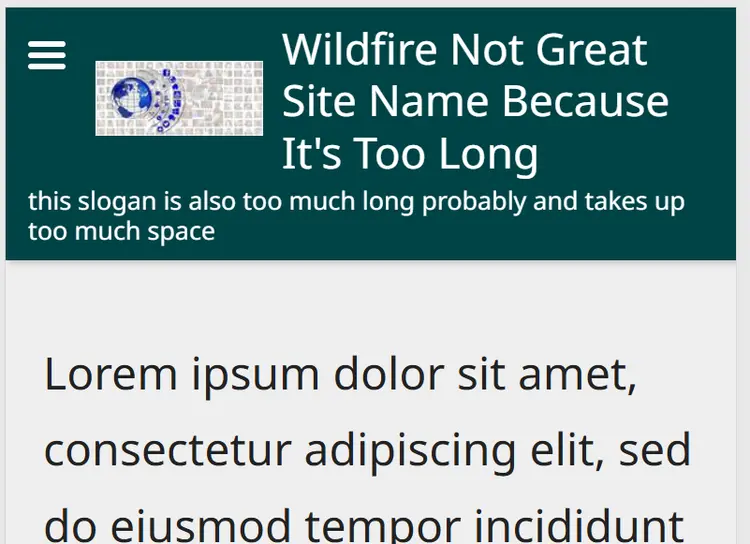
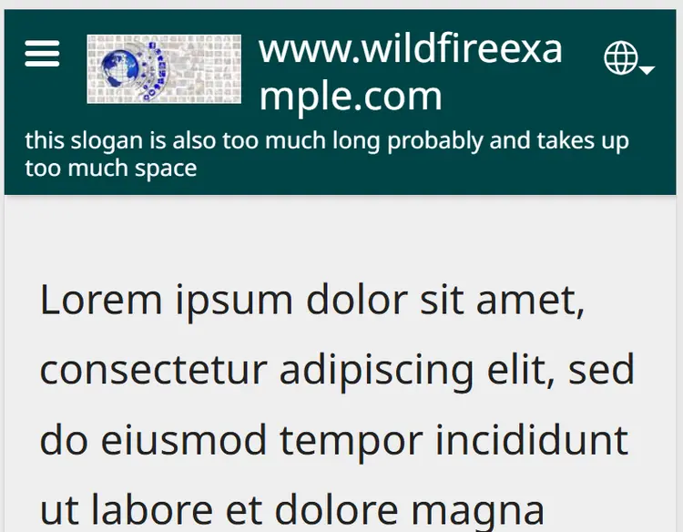
- Principle #6: Website name, logo, slogan
Smartphone preview
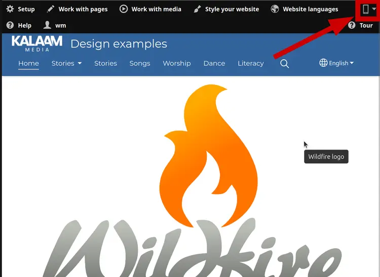
Wildfire gives you a preview of smart phone view, you can use it`to check out how your site looks on a mobile phone!
You will find the mobile preview in a dropdown menu in the topright corner, when viewing (not editing) a page.
Test on a physical Smartphone
You can create a QR code to scan with your mobile device to quickly visit your site:
- Click Guest preview
- Copy link
- Paste the link into your address bar
- Create a QR code:
- Chrome and Edge: Right click to open the Context menu. Choose "Create QR Code for this page"
- Safari: You may need to find an extension to do it, or use the Shortcuts app.
Warning
We suggest you avoid using "free" QR code generators on websites, as these may be insecure, and make your guest key available to third parties.
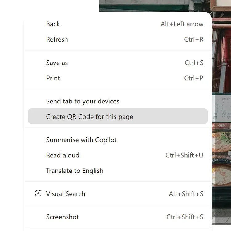
Create a QR code in Google Chrome and Microsoft Edge
Principle #3: Speed matters
Slow loading times will drive users away.
Limit how many videos are on the homepage (and avoid autoplay.)
Too many images that are large file-sizes could also make it slow (upload images that are resized to below 1MB.)
Remember different visitors may have different download speeds.

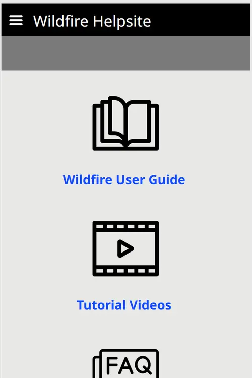
This site uses icons and links on the homepage to guide users
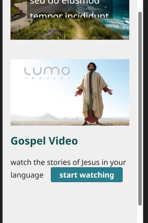
Here is an example call to action button on a homepage
Usability
Usability is concerned with how easy a site is to navigate, find content, and engage with the content. Low usability can drive away visitors before they find your content. Check usability on desktop and on mobile.
e.g. PDF - single item is not as usable on mobile - PDF Library is preferred
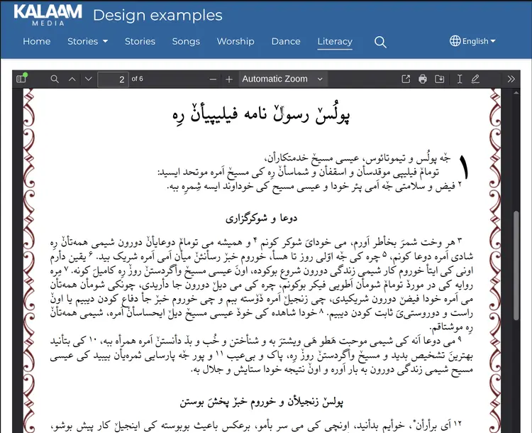
PDF - Single item works well in Desktop:
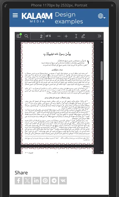
but becomes very small in mobile:
PDF Library is preferred, since the PDF is viewed in fullscreen

The Wrap text option in Image with Text is useful for longer text, e.g. a paragraph, or a longer quote. The image can be large or small. If the image is too large, the text won't actually wrap around it.
Layout changes in Mobile view
Mobile view is single column, and the left column always displays above the right hand column (in LTR languages.)
Think about your layout - should you use 2 columns or Image with Text - Side by side?
An alternating text/image looks good on desktop, but does not look as balanced in mobile view. Test how long your site takes to show on first load.
Lorem ipsum dolor sit amet, consectetur adipiscing elit, sed do eiusmod tempor incididunt ut labore et dolore magna aliqua. Ut enim ad minim veniam, quis nostrud exercitation ullamco laboris nisi ut aliquip ex ea commodo consequat.

Lorem ipsum dolor sit amet, consectetur adipiscing elit, sed do eiusmod tempor incididunt ut labore et dolore magna aliqua. Ut enim ad minim veniam, quis nostrud exercitation ullamco laboris nisi ut aliquip ex ea commodo consequat.